Jack Semancik is a political science junior and Mustang News columnist. The views expressed do not necessarily reflect those of Mustang News.
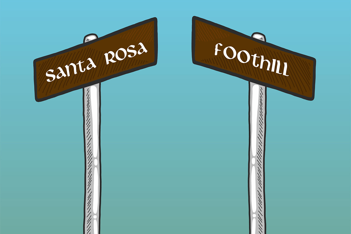
I’ve lived in San Luis Obispo for two years – a lifetime in student-years – and one thing has always perplexed me: street signs. What began as a slight animosity for their design has gradually transformed into a hardy resentment. Now, I’m not just saying that the street signs are ugly, although that is also true. I find that the current street sign design obstructs their legibility – something that should not be the case for an object whose sole purpose is to identify roads.
So why would someone in their right mind choose to place a white Gaelic font over a brown background?
I began my investigation on the street corner outside my house. Staring at the brash typeface left me with a sense of confusion and frustration. I knew that there must be more to it than meets the eye.
I searched through the municipal codes. Hours and hours of trawling public records resulted in a fried computer battery and a lessened desire to go to law school. San Luis Obispo Municipal Code § 12.32.120 only requires the sign be readable, and does not designate a color palette for street signs. I was still without any leads.
Maybe you, wise reader, are thinking to yourself, “What about the county? Perhaps the county sets that standard!” Nope. The San Luis Obispo County’s brand identity style guide doesn’t specify any design for the street signs. A phone call to the County’s Public Works Department confirmed that they do not manage the street signs in the City of San Luis Obispo.
I was at my wits end. Just as I was about to resign from the case, a lead sunk its teeth into me, like a cat in the dead of night. I decided to reach out to City Hall.
Apparently, I was not alone in my belief about the signs. City Council Member Carlyn Christianson told me that, while many in the community find the signs to be charming, she finds the signs difficult to read. Still, Christianson remains clearheaded about the signs.
“Unfortunately, it costs a lot of time and money to replace street and other signage, so I would imagine that until the lifespan of the signs is reached, any thoughts of changing the font will be deferred,” she wrote in an email to Mustang News. “With so many pressing challenges, this just isn’t going to get to the top of the list soon.”
I still needed to find out why. I turned up at the doorstep of the History Center of San Luis Obispo. After a wholly engaging discussion with the incredibly knowledgeable staff there, I knew what I needed to do. I reached out to the City’s Public Works Department. With a single email, the Public Works Department of the city of San Luis Obispo resolved the question that had been on my mind for years: why?
Apparently, our current street sign design conundrum began in 1997, when the San Luis Obispo City Council received a letter from a visitor. Although this visitor stated he enjoyed his time in San Luis Obispo, he was frustrated by the lack of proper street signage. Thus, the city council sprang into action, establishing a subcommittee to create new design standards on March 2, 1999. When the subcommittee gave its recommendations on April 18, 2000, it was nearly unanimous – until it came to the font.
Prior to the subcommittee’s recommendations, city street name signs used a sans-serif font called Series E, which is extremely similar to Arial. In certain parts of San Luis Obispo you can still see remnant signs from this period, such as at the intersection of Craig Way and Patricia Drive, which feature a brown background paired with a white, Series E font. Ultimately, the subcommittee was split between sticking with the Series E font or adopting Libra – the Gaelic typeface that was, prior to the design standards, primarily used as the letterhead font for the city. The idea for adopting Libra was championed as maintaining the consistency of the city’s brand. On July 17, 2001, after slightly reducing the height standard for the street signs, the project was opened to bids.
So that answers the when and why. This begs another question: “is the current design of the street signs achieving the design standards’ goals?” If the goal was to make consistent the city’s brand identity, then I’d say the design standards are successful. If, on the other hand, the goal was to design an easily legible sign, then the standards are an abject failure. Gaelic fonts are hardly readable when they’re printed on the cover of the Lord of the Rings, let alone when they’re speeding towards you on a brown signboard at night.
For me, the reason the font is so illegible is its varying letter cases. This is only compounded by the lacking visibility of brown street signs at night, against buildings and even against landscapes.
Although they are certainly unique to San Luis Obispo, our ill-designed signs should not be something for which we as a city are known. Any charm they have is outweighed by the burden they place on pedestrians and drivers.
San Luis Obispo has left me waiting for a sign – a legible one.

