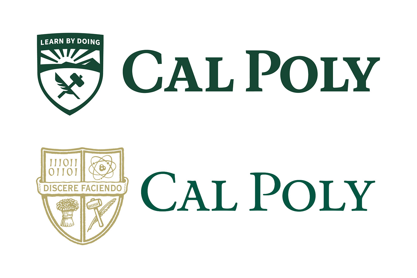
The new Cal Poly logo is in full effect, across campus and Cal Poly’s website and social media accounts. Last graduating class was the first to have the new logo stamped on their diploma.
When campus contractor SimpsonScarborough sent out a survey to determine student reactions to proposed logo changes, only 2,000 students responded. Fifty percent of them liked the two proposed logos. Neither of those proposals were the final version.
Thirty-one thousand people, including students, alumni, faculty and staff, responded to the survey. Only around half of which thought the proposed shields were appealing.
With a different font, a different mountain and sun, a different-shaped crest, a different hammer and quill than what was shown on the survey, one student said administration made a mistake in both shield design and student involvement.
“My problem with the survey was it was a sham vote. It’s like bad science. You don’t test a null hypothesis. You want to test something new, you have to test it against the old thing,” biological sciences alumnus Drake Murphy said.
He said he wished there was an option on the survey to keep the old shield.
However, SimpsonScarborough Chief Operating Officer Jason Simon is used to the criticism. He said it is common for new logos to get negative reactions.
“There’s a lot about things like it’s too simple, it’s too plain, sometimes it’s as reductive as ‘I don’t like it,’ which is important, it’s important that people like things or not, but it’s just as important, when your creating an identity, that it holds up the goals of what the institution is trying to achieve,” Simon said.
Simon said Cal Poly’s identity was fractured across it’s multiple logos: its shield and its conjoined ‘CP.’ He said it was hardly used across campus. However, it was present in every computer screen, set in concrete at entrances and present on binders, pennants and sweaters sold in the university store.
More importantly, Simon said, it could not be used online or in small print, because the icons present were too complex.
“All of the elements essentially were falling off and weren’t being visual,” Simon said.
In an interview with Mustang News before the shield was revealed, Campus Marketing’s Senior Storyteller Robyn Kontra Tanner said she did not have an approximation of cost to replace all instances of the shield with the new one, but that it would take six months to a year to fully transition to the new brand.
“It would be a big team effort,” she said.
Tanner said she knew there would be some pushback against the brand, but she said she thought the response would overall be positive.
“This is a reflection of everything that we’ve heard from our campus, and our students, and staff, and faculty as well. This is our brand. This isn’t university handing it down, it is something we all created together,” Tanner said.
A Cal Poly alumni involved in marketing explained some of the actions the university took.
“The act of engaging employees or in Cal Poly’s case students, is valuable, and it gives them a voice, and allows them to feel they are part of the process, but at the end of the day, it is impossible to get 22,000 people to align on one singular idea,” Cal Poly alumnus and Associate Strategist at branding company Siegal+Gale Joseph Pack said.
It is not realistic for marketing professional to release their final logos for approval, Pack said, because no logo will fully be approved by a majority consensus. That is why SimpsonScarborough changed aspects of the shield between the survey put out to students and the final product. Instead, professionals have to take into account what people like or dislike about the logos to change it before the final version is released.
Saying a student could design the shield is something people not involved in the marketing industry would say, Pack said, comparing it to basketball watchers telling a player to do a layout rather than a dunk.
There is a lot of professionalism required, including confirmation the brand will not interfere with CSU-wide branding platforms, Pack said, which means it would be better for a professional company to take it on.
Students were not completely left out of the professional process, however.
Tanner said two classes of marketing students were involved in the design, mostly conducting surveys and focus groups with SimpsonScarborough.

