Almost 7,500 people have signed a petition on Change.org to stop Cal Poly’s rebrand. Such a rebrand was essential, however, to one particular person – the designer of the last Cal Poly logo.
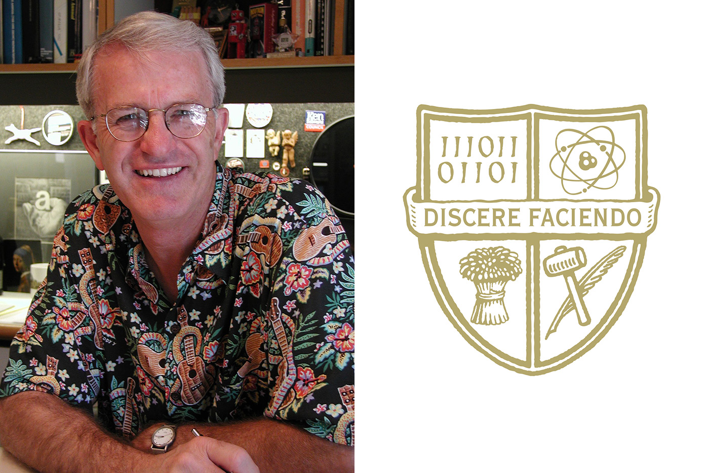
Pierre Rademaker designed both the Cal Poly seal and shield, while also teaching graphic design at the university for 14 years. Rademaker said he understood the need for an updated logo, but that it has come a long way from the former design.
Rademaker worked strictly with former Cal Poly President Warren Baker to design the seal for the university’s 2001 Centennial. This was when the lamp of learning, open book, feather and hammer icons were conceived.
“Everything in that symbol had a meaning,” Rademaker said.

It wasn’t until around 2012, Rademaker said, that the university wanted a design for everyday use. In 2015, he hatched the idea of a shield, which simplified the complex seal while still uniting community members with key symbols.
“It was a way of making everyone feel important,” Rademaker said.
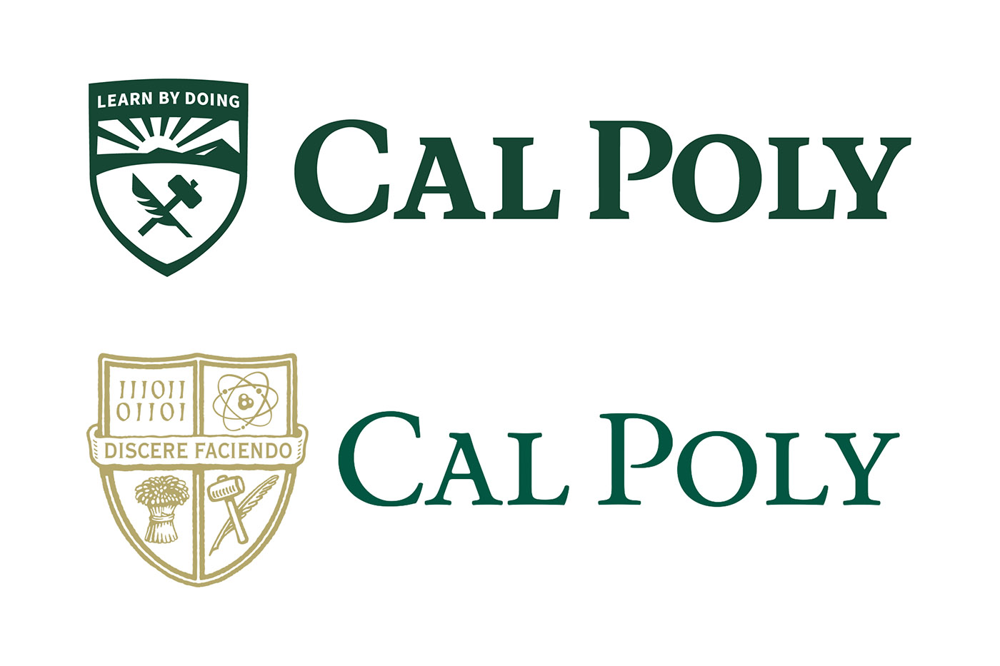
However, the shield became difficult to use in small sizes. Its thinness and light gold color made the logo nearly illegible when produced in digital mediums, which is why Rademaker said he understood the motivation to clean up the logo even further.
Rademaker was involved in meetings between University Marketing and SimpsonScarborough, helping to select the new logo.
“They couldn’t get the lettering right on the Cal Poly word mark,” Rademaker said. “It’s hard when you’re working with other designers. I’m a pretty particular typographer.”
The new logo sports the words “Cal Poly” in a thicker, darker green font.
“The typography is very legible and stronger than it was before,” he said. “It’s not classical or modern, but still strong.”
Rademaker has since left Cal Poly to pursue his freelance business, Pierre Rademaker Design, full-time.
Student experts weigh in
For graphic design senior Aliza Ackerman, the university succeeded in simplifying the Cal Poly logo. Minimalistic designs are trending, she said, but usually for startup and technology companies rather than universities.
“I think they did a good job of creating something minimalistic that still represents Cal Poly,” Ackerman said. “They’re making a logo that’s supposed to embody a whole university in three inches on a screen.”
According to Ackerman, the new logo’s thicker “Cal Poly” typeface will stand out in whichever medium it is displayed.
“Moving into the digital revolution, I think this logo is better to be used on a website or digital format,” she said. “That was a good call and will definitely be translated better in things like the Cal Poly app.”
Minimalistic styles, although bold, can also be limiting. Ackerman said she echoes the public confusion surrounding the decision to only include the feather and the hammer symbols, leaving behind the binary system icon, the scientific atom and the wheat grain.
“I think it’s important to keep the design as simple as possible, but if I was a math or science student, then I would ask, ‘Where my place is in this campus?’” Ackerman said.
In Ackerman’s graphic design classes, she said building a logo can take anywhere from eight to 10 weeks. The process involves looking at words and concepts that embody the business, creating thumbnail sketches and communicating key messages.
Graphic design senior Jake Giusto also has experience with rebranding. A freelance visual designer, Giusto doubles as a photographer for the College of Liberal Arts, where he often works with Cal Poly’s logos, applying them to photos and videos.
His biggest concern is the amount of different logo variations Cal Poly uses, which he says is more than most universities. Not only does Cal Poly use the well-known shield and seal, but other miscellaneous logos such as the thick typeface “Cal Poly” with a mustang charging between the two words.
“Cal Poly is not very consistent with its brand image, and that hurts them in a lot of ways,” Giusto said.
Throughout his work for Cal Poly as well as his freelance design, Giusto said rebranding any business means connecting with as many community stakeholders as possible. To do this effectively, he said, would require a local company rather than SimpsonScarborough, which the university hired to spearhead its rebrand.
“I think Cal Poly should’ve consulted a local agency or alumni in the field for this rebrand to be more representative of the community,” Giusto said.

